


10-23-2019 is anybody still out there? no? I am going to get back to updating this anyway, but I was curious. I have only had things to say recently that transition into bitter related topics, and generally nobody else has a taste for those, nor should they, and those take a long time to write, besides. when I am slightly less paranoid about pressing deadlines, real and imagined, I can potentially write something that is angry in less of a sad way again.
i left that up for two weeks because anything in the running to replace it that I could have posted fast without saying something inflammatory would have been worse.
…………………….

I wonder why they need new staff
This was in Guilford Connecticut. at first I thought this was too much and had to stop there to take a picture of the sign on my way back, and at that point it occurred to me that this is probably in fact a gag to get exposure and of course it got me to stop when i would not otherwise have.
Supporting the “gag” explanation, I have seen the exact same text highlighted as unintentional humor in the context of fast food restaurants several times in the past, but the improperly attached G at the end is throwing me off.

deliberately searching for the text showing up wendy’s repeatedly speaks even more to it being marketing disguised as incompetence.

I clearly remember very similar text appearing in a Burger King advertisement that was reproduced in National Lampoon’s True Facts: the book, published circa 1995, and it looked like its initial publication greatly predated that of the book. And at a later point somebody sent it to Jay Leno for his Headlines sketch under the pretext that they had found it in the wild themselves rather than in a book that was specifically showcasing inadvertent silliness correctly assuming that tonight show staff would not know or care. On another occasion Jay read aloud some ridiculous Dan Quayle quotes that were in fact deliberately ridiculous fake ones printed in Mad Magazine a decade prior to then. However, the “now hiring” is new and I have only seen it in the context of wendy’s signs, and never on wendy’s signs without that part so I must conclude that it is intentional.
I would have believed these were fabricated images made by a “meme generator” that allows people to easily customize fake sign text had I not encountered one in person. indeed the middle sign on my montage heap I was unable to find without additional obnoxious no-joke-is-too-obvious meme text slathered over it which is why it is cropped so strangely.
the incorrect G on the guilford sign indicates somebody was following orders and poorly rather than executing their own idea. Or maybe the latest order is to screw up at least one letter since meme generators usually do not supply incorrect letters.

however, on another occasion in 2014 somebody, perhaps the samebody, mistook a dollar sign for an S. Or perhaps the letter box only comes with two Ses. Or perhaps this means to subtly mock the Michael Jackson estate that in 2014 still owned the rights to the Beatles song catalog and could demand royalties on mere usages of the terminology “strawberry fields” even though there is no reason this would be called that if not for the Beatles song continuing to be considered part of public consciousness. The secret ingredient message also only includes two Ses so that may be more probable.

I still prefer the enticing mystery of “FISH IS BACK” (which also only includes 2 of S) Where had fish gone? Why is it back? Did it succeed on its mission? Does it intend to make us miserable since it failed?
according to legend, outside the north haven wendy’s i witnessed a sign advertising their Frosty product but had spelled it as “fpofty,” which had such an effect on me that someone I knewish online nicknamed fr0sty I had taken to calling fp0fty but I never told him that. I spent longer than was reasonable last week trying to find that picture but couldn’t which may have contributed to the frustration inherent in that last mess I posted. I only turned up a shot of the same location’s sign from a later point by which time they had found the R but lost the F while they set about advertising jalapeno presco chicken.

Wendy’s seems to occupy quite a bit of space in my mind considering I don’t ever go there. Not just because I haven’t forgiven them for replacing Roy Rogers in Connecticut (though I haven’t), also because the price of their food has doubled in fifteen years so its only real appeal is being less shoddy than the relatively still cheap McDonaldses in towns like these that lack Burger Kings, and presumably that setup suits them both.

Somebody on the deviantart website has already conceived of the public representative of that collusion without realizing it.
flurk I was in Liverpool England for ONE day in June and saw about three burger kings, and that is not a nation that takes kindly to additional claimants to the throne.
Incidootily, Taco Bell now longer has cheap in its corner either. For a while it was possibly to find combination Taco Bell/Kentucky Fried Chicken stores, but all I know of eventually dumped kfc, and I presumed that was because you could get a taco for 89 cents but the cheapest single item of chicken was three dollars. However, on my most recent occasion 9 tacos cost me about $17, the same as an 8-piece bucket of chicken, that would take me twice as long to eat, be much less complicated to order and whose contents it would not be necessary to thoroughly confirm the accuracy of before I leave the establishment. But there isn’t either of those in guilford so the topic does not usually come up.

in fact there is a magical barrier along interstate highway 91 and a weaker one across i395 further east that keeps kentucky fried chicken out of any place that I would feel like driving to under ordinary circumstances. The i395 one is weaker because the eastern half of connecticut is a miserable clam chowder framed picture of boats magazines about lighthouses white baseball hat wealthy boron retirement community that I stay away from anyway.

is this funny to you, wendel?
that I can be systematically unable to update the website for this long and not be stressed out of my mind about it is surely a positive indication. I have been spoiled by all the automated websites where I can just select a picture and it shows up. For this I have to manually upload it and put in the code for it and somehow or another I cannot spare the mental change to go through with that at the moment. After sorting out some prolonged nonsense with the comic book printing website I assure you I will get to posting filler trash that I already put on twitter a week ago.
I have been relettering what turned into pretty much the whole first comic book based on the same offhand remark that had me meticulously relettering book two in 2018, amidst also relettering book 3. It is a somewhat automatic mode, just very time consuming. I am not even necessarily checking for unintelligibility; if one bauble from before is readable but blatantly does not match another on the same page that I just did, I have to change that one also. If it looks too much like I was trying to imitate a font in the version that was printed in 2015, I have to redo it. If a word is HYPHENATED and on two lines, I started making myself redo all of that, which often requires restructuring the area around that. If the bauble’s shape is wrong, because I only decided lope’s should always be circular midway through preparing book 1 the first time and didn’t care that some didn’t match until THIS time, obviously I must redo that. I also decided kumquat’s shouldn’t be in that bad tintin pastiche shape midway through relettering book 2, and again let it slide if it was on a page I had already redone, but since I am re-checking every page, that means everything is up for
look see I am a sick sick person. I can’t draw well enough to be a good artist, but I can make the text readable, of nearly uniform thickness, I can make the containers balanced, consistent shapes.
Apparently I believe that so it is going to eat two weeks of my time every time there is one thing in a book that I want to change which leaves me vulnerable to witnessing other things that are no longer acceptable. I am glad I don’t have the energy to no look I’ll show you whatever beets I am here anyway.

Can you see what is wrong with this little section here? Probably not. At much smaller size on the page you definitely couldn’t. That is even worse! I hate knowing a small problem is there and nobody else seeing it, and just pretending isn’t there. Tiny little pieces of paper stuck to the carpet, I can’t live with that. The little stickers with a number on them stuck to new clothing. When somebody “cuts” off a tag on a piece of clothing, leaving tag residue which is not only worse than a full tag, but much harder to remove since you can’t (and I won’t) grab tag residue to pull the strings out so they can be cut. It has to go. Only I can destroy it.
Part of being able to make the fixes I “need” to make requires separating formerly flat pages, that I had been PROUD to be able to do flat, into multi-layered setups. I would select the color of the text containers, move those up, then expand the selection and fill that in with black. Which works theoretically but since in actuality I was not sick enough to need things to be totally smooth then, expanding the selection makes tiny little one pixel blemishes into these horrible skin diseases that I have to scratch out of existence, then I need to fill in the space on the base layer that I moved this stuff off of because it still has the old outlines which will show through if I move or change the shape of anything. I should be in a hospital. My brain should be connected to a computer as part of a circus sideshow because they can’t elephants anymore and it is not proper to call people with physical deformities “freaks” anymore, but I admit I am a freak and if somebody wants to pay to see a brain melt into porridge amidst the most tedious and pointless fever dream tasks ever taken on voluntarily by somebody whose life has no meaning, they don’t even have to pay since plainly I will do stuff for free just to feel like I matter to an ever less reputable class of people since nobody doing anything with their own life would stick around this one. And sometimes not even then; I could probably name 50 people with no skill or inspiration who watched my pages, acted like they cared, then abruptly didn’t despite still caring about the same brain dead hacks they cared about before and after me but you would not have heard of them and deservedly so. Including the one whose ultimate life advice was ‘let it go.gif’ if I have one undeniable attribute it is my fragrant inability to let any it go. If it will be my death, it was a life I could not have lived while attempting to let its go on the counsel of people who have less value than monopoly money which is at least pretty and distinguishable from other sorts of money.
I actually made a SECOND picture for somebody since I worked so hard on the first one that it was terrible even though that person has no bearing on my existence and probably already forgot about it. There are people who come to me every time I offer to do stuff for money and ask for something even though I know they have no money so I would have to do it for free if I did and sometimes I do. I am already buried in projects I will never finish that will haunt me until my death. Me offering to do work for money guarantees in the near future I’m going to be doing extra work that neither further my goals or gets me even the most pitiful organ grinder monkey money.

And apostrophes! I drew them vertically mirrored for years! I was so proud of myself to be drawing real typewriter apostrophers instead of ‘ those stupid things, even though I wasn’t drawing them properly and nobody cared except for me, later, when I realized they were wrong. It shouldn’t really matter since I have to rewrite all the text, apostrophes included, but a month ago I thought I wouldn’t and could get away with just changing the apostrophites.
But I feel a little better now.
———————-
10-4-2019 337am: really not a good week! and not cheap either.
////////////////////////////////////

a suspicious painting about which I have too much to say to say it at this time. What is important is that for the time being mit is someone else’s problem.
on that page
older version
very older version

what better way to honor the recently ceased publication that was one of my major influences in artwork and comic strips than by removing the most blatant reference to it?

I wanted to renovate the text on a lot of older pages because somebody who doesn’t actually care about the comic that i inexplicably wanted to and thought that I COULD impress with a printed version of it, casually suggested to me replacing the hand-drawn dialog with fonts, not aware that I had taken considerable effort replacing fonts with hand-drawn letters. It prompted me to obsess beyond any past level over the legibility of the text in the second book. And I thought while I was at it I should deal with this old thing.*
I have seen some people (other than that one) in person enjoy this section, after being indifferent to the first few pages, but while it works for pog, overall it is terribly out of character for lope, especially when i introduce the concept that without its hat the pitiful lizard will not take bold action. I had worried about this prior to the first printing in 2015 but eventually decided it did not matter. However the more i saw it the more it mattered to me! At last year’s alternative space weekend art show, I was telling people who laughed at that page that it was out of character! As if I didn’t WANT them to like that page. Soon they will not be able to! Ha HA! That means I win!
And then for christmas last year a different person who I don’t know offered the first criticism of that page, which was enough to finally inspire me to remove it. But looking now I see that he is only criticizing the number of exchanges and not the logic of that sequence of exchanges! The person also called the package “the MacGuffin,” kumquat “the main antagonist,” and pog “his side kick” even though each of those takes longer to type and say in addition to being less specific, and maybe I should not give too much weight to what he says, positive or otherwise. But something good came of it which is what matters [if i am a reasonable person, which i am not]. Also up to that point I always thought of kumquat as the protagonist of that section. Being told the opposite does not mean I have to change anything but it gives me rare insight into how other people might interpret a work that I wrote so long ago that its content has become in part abstract to me. Except on this one one part that I specifically worried about. It works better in an inconsequential pencil drawn comic strip made without a plan, before the lizard was assigned a personality or existence outside of that minor role.
I also ended up having to remove a view of the door that I really like, in the frame where pog says “did you want something?” but obsessive compulsion of course has made this a referendum on the artwork as well as the text so I end up changing a whole bunch of pages, again, I may [mentally un]well end up replacing a blander view of the door on another page with this one.
On a later page pog alludes to one of lope’s comments, saying “didn’t you eat the package?” which i now also had. I like that line; it only works BECAUSE the question and answer part is so inappropriate. Outside of that interlude it makes no sense for lope to claim to have eaten the package, and it is possible to imagine that you only imagined seeing lope say that, or retroactively interpret that as a silly thing that didn’t “really” happen, like when I show inanimate objects talking or transforming between panels, and directly acknowledging that sort of thing is an act that characters apart from pog could not commit without being distracting, and now pog cannot even do it! Tragic!
I have a personal “rule” that no significant part of this comic strip should be dependent on a person’s awareness of other media. On a much later page, elpse mentions “an ethnic sidekick from a lame Indiana Jones ripoff,” in foreground dialog, but no other character acknowledges that elpse said that and it has no bearing on anything else, though I still may drop that line when I get to reworking that section simply on the basis of my personal assessment that the indiana jones series is rife with lameness and unoriginality already and more importantly my not wanting to imply that elpse, it of green and greenish skin, has a perspective on what is and is not ethnic in movies that don’t even exist where it comes from, EVEN THOUGH to ME it is obvious that the INTENT of the line is to have be implicit that the ethnicity of the sidekick is relative to the protagonist, which in the case of Indiana Jones is definitively established, ethnicity and protagonistship both.
Howdy.
*And also replace every instance of “keilphix” with “kielphix” since the second way implies a more accurate, kielbasa-like pronunciation even though i no longer like that name at all and have shown kumquat being annoyed by it on newer pages, which of course means it cannot be changed! Even though only a few pages earlier lope announces that it changed its name from scragthrax so it seems like I am being redundant by having two characters that dislike their given names. However, lope, who is a little bit like me, definitively changed its name, whereas kumquat, which is much more like me, would not commit to doing so, and I likewise have not! ALTHOUGH kumquat lives outside of the law of any remotely functional society and really could call itself whatever it wants, but I only need to think further than hypothetical people who might criticize the comic strip, not ahead of myself thinking ahead of myself. But I will anyway so in four years I will probably change every pertinent page again to have an entirely different name than kielphix and also have kumquat not be annoyed by it.**
**Howdest.

I prepared all the pages for the [proof copy] of the next comic book and sent away for the proof print. I do not consider the work finished and probably will not have time to make a full order for the November 2 + 3 art show, even if i do inexplicably finish by the time the proof print comes and I do not find anything with it that is wrong beyond what I continued to poke at meanwhile, but at least for the time being if something goes wrong it might not necessarily be my fault. Additionally I have updated all posted pages with my 3 months of changes and they can be viewed from this point onward.
Regarding that up there, it initially started the chapter, but I thought it was more “professional” to start the chapter with a view of scenery, and also establish kumquat and pog’s presence. Also, I like the idea of the comic strip having no narration whatsoever, but i also MADE this dumb thing and have always had it between the end of one part and the start of another, even though at THAT time, part one was in a state of disarray and the whole point of my redrawing all that was to render further explanation of what it shows unnecessary. However, obsessive compulsion states I must include it if I am able, and so for now I am doing so.
Kumquat still looks awkward, but the other three characters look slightly better. Elpse no longer has fish whisker things protruding from its face nor stripes on its thigh regions. I LIKE those details, but if I have them here, then I risk forcing myself to include them everywhere else like I did after I added little zigzag stripes next to its feet and hand areas. Also, nemitz is still a crumbag. THAT would be truly impossible to fix in time to get the books printed.
This is only a half page, but i used the second half to cram in my various website urls. Of course I still have people asking if I have a website while looking straight at my business cards that only exist to show urls for my 500 different websites, so this may be irrelevant. Yes so I have tentatively placed this on the inside front cover. I will of course scrutinize that text’s legibility. I do not yet have something for the back cover or a preview of the next issue’s front cover for this one’s inside back cover. I have a lot of cover left to cover.
In may I offered “100 free sketches” at the twittor website in a completely misguided and cynical attempt to expand my audience, not considering that I might end up with an audience full of expansion fetishists, or that I do my best work with no audience.
it “worked,” but only when I put in considerably more effort than i expected to, and of course only when drawing other people’s characters and noncepts. Not helping were folks who gave such information that there would be no potentially satisfactory way to draw what they wanted that could be at all simple, but only a few of them seemed so entitled that they were absolutely depending on me to do so, and so as usual the fault was mine for assuming it would be easy and doing it anyway, even though never once has something been easy when it seemed like it would be. To help disperse the blame, I inserted less reputable creatures into some of the images that I might complain about instead, and those will be appearing here.

free sketch #11, for https://twitter.com/lazy__lucy! a moth person whose eyes in fact always have heart shapes in them, even when not approaching a desirable destination.
I meant to draw a fork and knife both wearing little bowties beside the plate but thankfully did not do so. I believe I outlined their shapes and then didn’t notice I was drawing over them when adding the table cloth and then forgot they had been present. I also did not notice that the bowtie meep on this occasion lacks arms and perhaps both of these things are evidence of order in the universe.

free sketch #14, https://twitter.com/WhiteDahlia_ , time traveling assassin spy, tracks down the leader of a mysterious but most assuredly nefarious organization. I presume it is not actually missing an eye but since it has both eyes closed when it is feeling particularly proud of itself and it never isn’t, eyesight gradually becomes irrelevant.

free sketch #27 for https://twitter.com/IanKeith ! Phaeux helps nemitz have a good time on the swing set

free sketch #?, https://twitter.com/HeathenHeanow/ (who actually draws better than i do)’s character, also named heathen, bestows upon nemitz the order of the banana and birthday cake-flavored ice cream with sprinkles. nemitz reacts with mits usual ingratitudinal demeanor.

free sketch #28! https://twitter.com/TheAusSpideyGuy s character Leonardo knows that the best thing about having six arms is being able to pull rabbits out of three hats at once, although sometimes it is difficult to find three rabbits to participate in your routine on short notice.
pog was never meant to have anything in common with a rabbit visually and I never considered that there might be a resemblance until people started calling pog a “rabbit,” including the tip-soliciting lady who gives out animal shape balloons at a local restaurant who thought it really necessary to ask my 4.9-year old niece if she could find “the bunny,” referring to pog, on the sketchbook page I wasn’t finished with or actually exhibiting after mis-indentifying the actual rabbit i drew as a moose, though admittedly I had put a stupid helmet on it. Which happened last week even though this picture is from a month ago but it seemed relevant. Therefore pog seemed a natural reluctant choice for this role.

The person also thought my drawing of the sprite from secret of mana was a horse. Which is probably why I did so few ACTUAL sketches for this.

free sketch #36 https://twitter.com/DraygoDraygon ‘s character also named Draygo sees to it that nemitz gets squashed. nemitz feigns ignorance as to why this may have been necessary.

ree sketch #38: twitter.com/SpecstheFox and nemitz go sailing together. you might think it impressive that dumb old nemitz was able to rig the sail but nemitz probably bribed somebody else to do it in payments of stolen beans. (the captain hat is also stolen)

free “sketch” #45! https://twitter.com/CuntyMcPunty ‘s character Silver aids the cause of justice. rather than a specific content suggestion i was instructed to “go wild,” which in my case means “go stupid.” It might have been more appropriate for me to say: I don’t know you, you don’t even watch my page, and I don’t particularly want your name to appear on mine, and so I don’t see any reason to go anything on your behalf, but i did anyway because I am sick and I need help.

free sketch #¿ for https://www.deviantart.com/artificial-demon ! Acid Goblin hacks nemitz’s computer.
That is of course only the monitor but nemitz is ignorant and probably thinks that part is the computer.
nemitz should not even HAVE a computer. mit probably just looks up pictures of beans on pinterest.

aksi: here is the actual original sketch that I used to advertise what I was doing. I think only three that I delivered were actually of this level of quality. I figured I could chank out ten of these a day, forgetting that nemitz in a basic moron pose is really easy to draw and that I hold myself to a much higher standard when drawing things that I want other people acknowledge the existence of. Nemitz deserved to be promptly forgotten once mit is crushed by that tree.
and a “raffle” is when somebody demands that you share their post and watch their page for a chance that you MIGHT get something for free. I think it is despicable. And so not only did I commit myself to much more work, I necessarily capped the free advertising I could get from it on account of my committing to granting something to every participant but only a set number of them. Does that all make sense? It shouldn’t! Also the nature of this sort of thing meant that most of the people who did participate were sickos who just like the idea of getting stuff, not much caring what it is or who it is from. And I could tell because when I checked their pages to make sure they had retwutted my post before making a request of me there were often already 6 fresh raffle retweets above mine. And of course a few of them didn’t do it at all.
Or they will have extremely niche, stupid tastes that I can’t even talk about with explaining and making myself seem insane just for having been directly in contact with, and only share the offer with other people who are even deeper in the same dumb niche, and then blambi, I have to draw a whole bunch of 8 limbed inflatable monstrosities being force-fed after being flattened by steam rollers. You know, stuff normal people like.
By this point I have finished about 56 of them, which is roughly half because I kept letting people sign up after I closed the thing. Even though decent people would probably honor my set total and not ask to be let in after I had closed it. I wouldn’t let nemitz get away with that! Or I would certainly sternly and directly rebuke nemitz instead of talking indirect trash about mit on another website. It wouldn’t be professional to talk to fictional characters on my website in an insincere manner.
The job is yet incomplete but I believe I will be concluding book 3 at page 2-35. On the website I have that section as ending with 2-39, but then that only leaves 22 pages for the next book. This change leaves it with 26 which still seems low but there is at least one, possibly two new pages that I will insert to show the gwakpazirs/”urkel spheres” again and also the kaklabesk creature which I made such a problem for myself over trying to explain on the most recent new pages despite it only having appeared on one page prior then. But if it is on TWO earlier pages, THEN my time was well spent! Some of the gnome pages are too bunched up, also, so I can definitely push that up to 30 pages. With the remaining pages I can make some origami pterodactyls.

2-55 is particularly messy, even if as a work of spatially-efficient visual art I was particularly pleased with that when I first constructed it. That was the first page were there were conspicuously non-rectangular panels. But I suppose rectangles are preferable to wrecked angles. The dope getting beaten up is worth presenting in a coherent manner.
I included that picture just in case once i DO sort that out I forget to return to this and correct the link. Right now my right arm hurts because I tried way too hard to scrub a toilet today and I want to minimize excess fiddling on this website entry but I must think about my legacy. Fortunately I do not use a leg to scrub toilets.

Additionally I notice a shift in the artwork at 2-30ish, especially once namitz and elpse leave the hospitarium, to a lot more cross-hatching, although somewhat more orderly than earlier stabs at it, though with duller coloring. I was surprised that the last few I have been working over required surprisingly little art editing, compared to the previous two books anyway, beyond the difficulties I already alluded to. The editing at THIS point is tedious but not difficult. I seemed to reach a level of stability roundabout 2-21 in which I had just enough real ink and inexplicably coherent backgrounds despite a large amount of straight lines and inorganic details that don’t change between panels, and then I lost it again once nemitz started wandering around screwing things up. And so to edit further pages will require a different “rhythm” than i had developed. Nemitz thought it could stop me, but stopping me there allows me to continue elsewhere! I would thank nemitz but I would never thank nemitz.
These are all magazines I saw at the same store, Big Y in north branford connecticut, on the same day, august 14 2019. except for one that I had a pre-existing but unposted complaint about that this reminded me of.
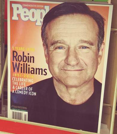
Robin Williams five years later: still dead, still having his death exploited by people with no lives. Pardon me, too soon? I admit I only saw this magazine a week ago.

Is ten years too soon to say that Patrick Swayze had as much impact on my life as I did on his?

Hey how about 1999? Remember when one person got dead that year? Someone who was only famous because his father was also dead?

or how about the time that- what? I didn’t even know Farrah Fawcett was dead. I suppose this does serve a purpose. However you aren’t doing a very good job remembering “the Beloved Charlie’s Angels Star” if you forget that she quit that show after one season and spent the rest of her life trying to not be remembered as its star. Also: this and the one before it have both been placed beside the same issue of

National Examiner, ALSO obsessed with a death that happened ages ago but I forgive them for that because The Tabloids never stopped touching themselves while thinking about Diana’s death for a minute. That’s the closest they come to journalistic integrity. Call it monogamy if you want.

and just over to the right: Hey Daniel Ratcliff isn’t doing any more Harry Potter movies. Seems like a good time to put him on the cover in that costume and run a story on this like it’s new.

hey remember when you could only watch tv shows when tv channels said you could? Wasn’t that great? Do you remember when you couldn’t even find out what programs were going to be broadcast and when unless you bought a separate little book just for that? No probably not since studies have shown I am the oldest person on the internet.

if you are like me (as I already established you aren’t) you barely remember the early 1990s and never sought out any of these idiots on purpose but saw them on your television incessantly anyway so that perhaps you believed they appeared on the same program called 9021OJ in which every one of those bleached smiling scumbags in that pile get murdered. These magazines are here and separate to set you straight and possibly no other reason.
I actually did like the Naked Gun Movies in which Mr. J appeared, and since I do remember that, no magazines are necessary.

speaking of no reason, why celebrate the thirty-fifth anniversary of these movies when it is also the thirtieth anniversary of movies from 1989 and more importantly the twenty-fifth anniversary of movies from 1994 and yet more importantly totally pointless? Unless the critics are actually being CRITICAL of movies that made loads of money and have inarguable legacies there is nothing new to say here and they could just reprint what they probably ran ten years ago. maybe they did. George Orwell’s concept of 1984 society using thought control to keep people in their places greatly over-estimated how much effort that would require.
i tried to watch indiana jones and the temple of doom, just incidentally, a few weeks ago. It is a really stupid movie! Loaded with stereotypes, improbable mercy from adversaries shown none and Harrison Ford making even less effort to be likeable than Bill Murray in Ghostbusters, without two partners of equal rank to balance that out. But i appreciate that it gets fight to the point and doesn’t waste time trying to pretend it is a smart movie. I sure wouldn’t want to read a magazine article about it NOW.

hey how about some dead bands? Look it is even in their name! And by gamera they are GRATEFUL to be mentioned at all. You know the only thing I like better than hearing music from the same singers and same instruments for hours simply because somebody else told me the band is great-filled is READING about it.

how about some dead decades? the 1960s: the only time anything ever happened. That was a decade that changed a nation. How many of them can claim that? That is why so many countries seem like they are stuck in other centuries; only one of them can change every ten years, and luckily this one got its one chance five of that ago.
magazines tend to agree on this. they will place 90% of the greatest songs OF ALL TIME, that being all sound created by all beings in the history of the universe, all of which having been heard and equally evaluated, into this decade* via

The Man’s 500 most acceptable mainstream vocal English-language songs of the middle scrap of one century issue. What a shock that the one their magazine is named after tops the list and a band with the same name dominates it otherwise. They would have me believe “the times” are “a-changin'” when their musical taste was chiseled into granite around the same time my mother was born (presumably a coincidence). Luckily Rolling Stone Magazine is not generally stocked by the checkout aisles as Big Y World Class Markets or else I would have to write a version of this web page once a month rather than every two months.

*that figure was a cynical guess; statistically it is apparently only 40%, but the closer you get to the top of the list the closer it comes to that, with 9 of the top 10 coming out within a 12 year period that includes the 1960s.

History Channel Magazine ALREADY had a Beatles issue THIS YEAR. Do you know how much history there IS? All the history in HISTORY. And the magazine named after it can’t find enough in five months to not have to go into reruns.
i suppose in a media format that is dying out you stay in business by reminding people of times when more people bought magazines. Because when those times actually do a-change, expectations a-do as well, which a-is not good for business. Achoo! This may seem to contradict the adage of those who forget the past being doomed to repeat it, but consider that this may itself be the doom prescribed. This is what we get for for getting.
Oh this is too much. I need to think about something else.

Dead civilizations! My favorite!
////////////////////////////////////

addendoy: i had to take the pictures in the store somewhat hurriedly so the details were not all clear and I did not realize that the lower two sections are showing different pictures. Some dorky band and touching a rock in space are evidently not just more important, but substantially so than the civil rights movement and one of United Statia’s worst wars. I could definitely claim there was a racial angle to this if I could do so without screwing it up.


this is the dominant project of the moment. Trying to make awkward comic strip pages from ten years ago look slightly less awkward by surgically extracting as much of the rigidity, bad mouse-done “ink”work and bad anatomy out of them as is feasible by some arbitrary point that is likely still too late to get new books printed by when I want to have them. My anatomical rendering skill and general awareness are still terrible but I am considerably less likely now to commit to a weird guess. This example shows some unusually bad dialog flow, which is why I chose it, even though it is not one of the problems I cited. This is also a problem! There is no sense in mentioning it twice!
Ostensibly it should not be that hard but there are a few hundred drawings in here, if i estimate 13 panels per page and 30 pages it comes to 390 which is likely a bit low. Also I “have” to separate the panel boundaries and word baubles –in the event it isn’t necessary to rewrite the text entirely, which is frequently the case with elpse, or redraw the bauble shape, which I do for pog and nemitz since I decided that less serious characters have less serious bauble shapes after this point– to maximize my ability to correct awkwardness on them, which is also a bigger job than it would be to a reasonable person. In 2009 I obsessive compulsively used hard black for all outlines and more shading than was called for, so getting the components separated is tedious but necessary for reasons too tedious for me to explain. what it amounts to is that I have a heirarchy of sicknesses and in order to live with the chief sickness I must endure some less prodigious sicknesses that both necessitate that I do strange needless work and that I do the work very strangely, to a needless degree. A long time ago I was proud of the fact that I could arrange and complete these things all on one digital layer. Also of using pure black for all outlines and text. Now I definitely wish I had not been so insistent on those things!


Why did i think it was a good idea to use solid line shading on skin? I imagined it would blend into a smooth grey but in the end it looks like a bunch of scratches. It looks good on wood. I felt so empowered to be using real ink from real pens at that I thought it could solve all of my problems! It looks better than my bad mouse pretend ink but then I kept adding more and more of it so it was still a mess. page 20 has some particularly bad examples but I have not gotten to altering that one yet! But I “need” to make a website update today so this is that.
Did I have a broken video here for the past 5 days? I thought I switched it to one hosted on my own space but I must not have saved that. Whoooooopth.
////////////////////////
A person identified as pinderhooks recently alerted me to this. Somebody uploaded the full film without permission from the copyright holder Pulse Distribution and I then likewise edited it without permission from that person.
“Hercules” is a low budget cartoon from 1997,that probably has only about a standard tv time slot’s worth of animation which is stretched, sometimes painfully so, out to 48 minutes so it can occupy an hour block and present itself as a feature film instead. I assure you, the cutting room floor was EMPTY. Everything they had went in here and it still wasn’t enough. Consequently its most striking feature is the profoundly horrid editing; at points there is up to 12 seconds of no/barely any motion before something happens. It has a look like it is animated by the company which did robert smigel’s “saturday tv funhouse” cartoons with assistance from the cdi-Zelda gang for closeups. The only indication that you are seeing the film as intended and not an insulting edit like this one is that the music keeps playing and playing and playing unbroken. I really should have had the sound muted while making this since that dorky trumpet fanfare is haunting me now
I watched it once and had the terrible idea to cut out and assemble all the stupidest parts. Completely on a whim when I have obligations stacked higher than the person who storyboarded this I decided to spend several days making a cheap movie that nobody cares about look even cheaper and less worthy of interest. I initially endeavored to maintain the spirit of the original cut when altering the film but when it came out to over ten minutes, nearly a quarter of the full film’s running time, I wondered if it would even come across that I didn’t extend the length of those scenes myself, and in the event of such a perception, why had i chosen the most boring parts to do that in? Somebody thinking sensibly could probably get this under nine minutes but every time i go looking for stuff to cut out i remember another thing from my initial viewing that might be worth squeezing in there. Somebody wishing to only show everything important and not waste time could probably get it to five minutes.
At times the film resembles a bad stage play, in which actors struggle to remember their lines or read off of cue cards. I wonder if the dialog was recorded live, like an old popeye cartoon, with the actors watching the cartoon and waiting for the right time to say lines, but with a considerably lower production budget and no ad-libbing. At one point you can even hear a character, the boss hydra head, start to say “oh shut up” while the character is off-screen, then seemingly realize it, and wait for the scene to change to complete the line. It is not in this edit; eventually I considered that the significance of that would not come across due to all of my deliberately bad editing.
There are a few moments which could be seen as vulgar and uncharacteristic of what I usually produce but once they suggested themselves to it seemed pointless to not use them. They are vague and might not be apparent anyhow.
I do not actually hate the film, even if Hercules himself is dull and conspicuously beardless, since the primary marketing strategy for this sort of product was to get their product mistaken for the disney version, even if the actual content is quite different, and that second fact works in its favor, I think. Apart from calling every character by their Greek names except for Hercules, but that convention predated Disney’s version. Eurystheus’ voice amuses me. There are numerous bits of weird animation and dialog that I like just as they Are. The film is broken and confused, and I relate to that. It screws up and skews the myths but not to the banal extent that disney did. Hercules, as a “hero” who murdered hundreds of people, including his first wife Megara and their children, and had considerably more male lovers than female, chief among them Iolaus, his companion in this film and nephew (and also recipient of Megara as a re-gift-wife in versions of the story in which Hercules only kills their children and not her), is never going to be a g-rated 1990s role model for children. Hercules’ murderous fit of madness is actually alluded to in this film but you only see a ruined city and it is said that only one person was killed, and that person is not even really dead.
Everything i know about the disney version is from contemporary advertisements for it and a description of Danny Devito’s character that I read on a burger king cup around that time (as with the nuggets, Burger King didn’t bother to not give the cartoon-branded products to regular customers) and what I read on wikipedia just now, but I know it depicts Zeus as monogamous and Hera as Hercules’ biological, non-hating mother. Zeus’ infidelity to Hera and Hera’s utter hatred for Hercules is at the very core of the Hercules story. And making Hades the easy bad guy dumps all nuance of just what the god of the underworld is. He isn’t Satan: he does not buy souls, he doesn’t trick people, He isn’t evil, he just happens to preside over the dead. The Greeks had this idea millenia before mopey nerds started obsessing over the idea of misunderstood sad monsters. Mopey nerds who of course only consider the disney versions of anything so they think this concept is new. Hades does covet the souls he has and takes revenge when people try to cheat death but all the gods are covetous and vengeful. Anyway Hades does not appear in this Hercules film so that is unimportant.
worst selling video games part 5
part 1
part 2
part 3
part 4
Hasslevania
Phantasy Starve
Lentil Gear
Cruel Spot
Turtles in Grime
Sash TV
Sucking Crew
Leafal Inforesters
Margaret Snatcher
Recliner Dash
The Lost Vicodin
Darrow the Aclubat
Chakan: The Piano Man
Breathalyzer of the Wild
Turok Dinosaur Stumper
League of Ledgers
Chunderpail
Mario Quaker
Felt-a-nun
Epic Hickey
Ruffle Knight
Twattoon
Overwatched
Tandy Crush
Call of Snooty
Yoshi’s Crackhead World
Eldercare Scrolls: Daggerfallen and I Can’t Get Up
Pants vs Zombies
Super Floors ‘n Grouts
Turriduckan
Plaidical Rex
Mega Man Aches
Sonic and the Black Lung
Kirk Fogger
Leggo my Eggo Star Wars
Putt Putt goes to the Loo
Forgotten Wurst
Chrono Floss
Kingdom Ozarks
Bart Vs. the Space Heater
Comma and Conquer
Lemons 2: The Limes
No Man’s Pie
Tales of Sweater Vestiny
Resident Emo Phillips
Stunt Racism FX
Defender of the Jim Crown
Clean Your Room: Total Chore
Lowell Name: Weicker


comic page 3-41
all other pages are of course there.
i am not at all satisfied with the backgrounds; they are incomplete and have hardly any silliness lately, but i must keep going. I am likely quite past the point where I can have a third comic printed in time for the one art event that I attend in early november but it still would be prudent to resume the task of furthering my progress on that.
in MY mind this page makes sense, but based on one person’s comments, seeming to consider kumquat to be at risk of what elpse experienced on the previous page even though kumquat has already brought that on deliberately and then blatantly explains that elpse will have a different reaction to the formula since I correctly assumed just showing it would be inadequate. Absolute clarity has always been a problem with this comic strip, since I do not like to overstate things, since that dilutes their effectiveness, and even when I do overstate things it still is not clear enough! (in another example I added the word “flavor” to the end of the mouse-over text on the above image so it was more obvious I was referring to the nerds candy and not just social nerds of unusual colors) This specific matter is not of great importance, however, I primarily want to tie up loose ends from the first two sections that I wrote before I had even the meager “plan” that I do now. This page, to me, finally resolves one such end, the extremely brief appearance of kaklabesk in part 1-2 that is seemingly never followed up on. I must have thought I would do something more meaningful with it but the time in which to do so has elapsed so the longer I wait to explain it the worse it is. Of course 60+ pages on likely nobody even remembers that kaklabesk ever appearred, but I do, and so I must tend to it. There is yet another unsorted issue that the blue loser lizard will have to handle, which it is not yet aware of, and which will be slightly more important than this one.
I would refer to the creature as a “loserd” or “lozerd” but the pronunciation is not intuitive and with “loozard” or “luzard” the meaning is not intuitive. Yet one more way the creature is a loser, there is not even a convenient way to refer to it!

Star Wars chicken nuggets. Why not call them womprat or tauntaun nuggets with “chicken” in small print beneath to at least make some pitiful attempt at justifying this latest needless dilution of the already plenty diluted star wars brand? (Gosh even star wars the food brand is diluted.) Because star wars is now “family friendly” and it would be evil to consume space animals? Is it just easier to depend on existing cognitive dissonance as to where meat comes from?

I realize that there was a dork dealing “death sticks” in the clone attack film long before disney became involved, and that star-wars themed unhealthy food is nothing new,

but EVERYTHING in the prequel movies is stupid, and there is something campy and [to me] endearing about the likes of

c3p-Os. At that point Star Wars was still fun and George Lucas’s head was not totally up his own rancor pit. But even when Lucas was writing the movies like bad webcomics there was some purity to them and I think it was understood that they could not go on forever. Star Wars isn’t fun now. It is “iconic” now. It is like mickey mouse essentially. The emphasis is more on protecting its legacy and pleasing committees than it has ever been.
I also cannot help noticing that while r2d2 still adorns products that no celebrity likeness has been procured for, the silly and awkward c3po has been excised in favor of the small and efficient robot bb8, which serves approximately the same function as r2d2 in this context and provides no contrast. That isn’t fun, either. And likewise there is nothing fun about these nuggets. They are just anti-biotic-free 100% white meat star wars nuggets. Of course nuggets are meant to be inherently fun regardless of branding and i know from experience that unusually-shaped nuggets can be horrifying, but this is pointless, wasted branding.

I am referring specifically to the rugrats-shaped nuggets that i mentioned in this very old post. I seem to have neglected at that time to indicate that I was legitimately afraid of these nuggets. I might have remembered had I access to a picture of them but this video was not on yute-oob until four years later and I sure never saw the ad on television; elsewise I might have been prepared for them to show up. As a fiveteen-year-old i thought I was too smart to watch the cartoons this advertisement would have aired amidst even though I spent hours in AOL chat-rooms, hoarded midis out of Doom wads and all I ate was chicken tenders. (and coke)
My father just went to Burger King and among what was procured for anybody else, ordered me chicken tenders like usual because that was all I would eat because I was a horrible child and instead of safe, innocuous mutilated bird flesh, they were these indescribable THINGS. And there was no warning; nobody shows the contents of the box to you before they drop that into the bag. The video indicates that regular chicken tenders were still available somewhere but the Burger King in Branford Connecticut sure didn’t have them, just as they didn’t have the regular tenders when the shapes inexplicably became dinosaurs a few years prior. But those I probably could tell were dinosaurs. These were just scary, whatever they were. The rugrats are already sort of scary when drawn properly. When you have their crude shapes yet further crudely simplified and filled in with a vague orange bready texture, they are yet more so and I want nothing to do with them. This put me off eating meat like no undercover video of factory farm conditions ever could. I still ate them, of course; I don’t waste food, especially fried chicken. But I sure had to not look at them. I may even have shredded them into yet smaller pieces so they did not FEEL like those shapes. The argument can be made that star wars nuggets opted to use bb8 instead of c3po because it makes for a less frightening nugget silhouette but I am opposed to creative nugget shaping in general.
Oddly enough rugrats also increase in scariness when rendered with increased detail.

i only took note of these statues when i was leaving the Pleasure Beach amusement park in Blackpool a weekish ago, so have only this one picture of them, but what the heap is wrong with the one on the left? It looks as if worm-like parasites are boring into its skull. I didn’t have to think about that, it was my initial, only impression. It makes me itch to consider. Fortunate I was that I did not have any nuggets on hand for my dining experience to be ruined with. I don’t know how you WOULD render sparse hair on such a construction but I am certain better alternatives could have been found if any had been sought. There is definitely something wrong if i get annoyed with that before I even notice the needless buttockal detail on the fairly detail-sparse dog to the right. But I still noticed and now have drewn attention to it so I will see if I can find another picture of c3po to distract myself from that.

I feel rather let down by Dark C3po.
welcome to disney world


on second thought let us not go to disney world. I am not obligated to provide a reason.
Sea World is more to my liking, anyhow.


That’s enough, I’m outta here.

This is not the correct way to eat at McDonald’s.